

part1: 如何使用RIA Services
part2: RIA Services更新和验证
part3:RIA Services数据新增
part4:皮肤的更改
part5:@L_404_5@
part6:Endpoint的设置
part7:如何使用RIA Service Class Library
part8:url重写和界面友好
对于Chart的使用最重要的是我们的数据源确实需要它。我本人比较喜欢数据分析,特别是报表的展示,很一目了然,让你不需要花那么多时间去用Excel做透视图。
这里给大家展示的数据源选用经典的数据库ADVENTUREWORKS。
首先还是创建我们的Services.
1. 如下图所示我选择了三个表,以employee表为主,它和其他表都是1:n的关系:

2. 创建Domain Service。
如果你觉得这里的domain Service创建和其它的domain Service创建一样的话,而且你不知道如何创建相关联的Domain Service,我希望你详细看看这里。
以上面的三个表为数据实体创建好Domain Service后,会自动生成一个类和一个Metadata的类。
如果你仔细观察会看到Metadata类中有如下几个实体容器(EntityCollection):

public IQueryable<Employee> GetEmployees()
{
return this.ObjectContext.Employees
.Include("Employee1")
.Include("EmployeeAddresses")
.Include("EmployeePayHistories")
.OrderBy(e=>e.Title);
}
这样我们就创建好了一个带关联的domain Service。
3. 关联数据的展示:
和以前介绍的数据展示一样,直接拖拽。
首先我添加一个Data Form,然后把Employee切换到Detial然后拖入DataForm。
RIA Service会自动生成而且会绑定到Data Form。
<toolkit:DataForm Name="dataForm1" ItemsSource="{Binding ElementName=employeeDomainDataSource, Path=Data}" ReadOnlyTemplate="{StaticResource employeeread}" />
<riaControls:DomainDataSource AutoLoad="True" d:DesignData="{d:DesignInstance my:Employee, CreateList=true}" Height="0" LoadedData="employeeDomainDataSource_LoadedData_3" Name="employeeDomainDataSource" QueryName="GetEmployeesQuery" Width="0">
<riaControls:DomainDataSource.DomainContext>
<my:AdvWorksContext />
</riaControls:DomainDataSource.DomainContext>
</riaControls:DomainDataSource>
然后把Employee下面的EmployeeAddress和EmployeePatHistory拽到页面中,千万要是Employee下面的。

然后编译一下,运行就会发现你选择不同的Employee时后面的地址和薪水都会变化了。
如果你变一下后面的数据不显示,手动去给两个DataGrid绑定数据。
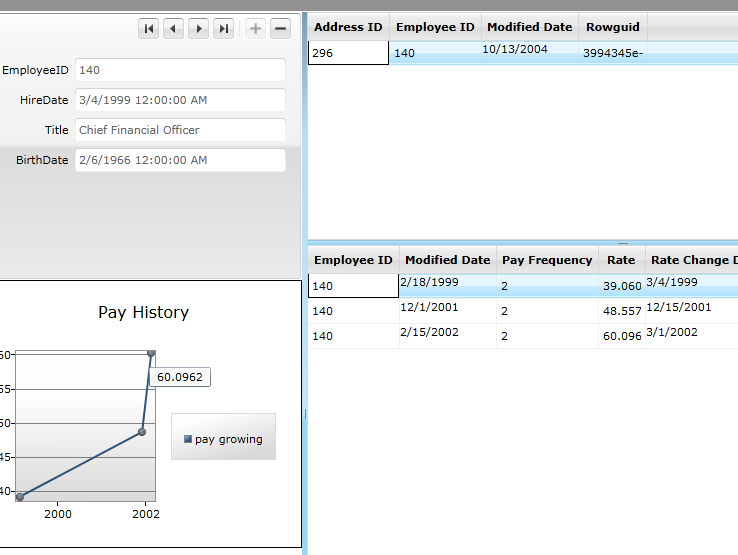
4. 使用Chart来展示Employee工资的变化。
首先你需要从ToolBox中拽人一个Chart控件。然后修改它的内容如下:
<toolkit:Chart Grid.Row="1" Name="chart1" Title="Pay History">
<toolkit:Chart.DataContext>
<PointCollection>
<Point>1,10</Point>
<Point>2,20</Point>
<Point>3,30</Point>
<Point>4,40</Point>
</PointCollection>
</toolkit:Chart.DataContext>
<toolkit:Lineseries Title="pay growing" ItemsSource="{Binding Source={StaticResource employeeEmployeePayHistoriesViewSource}}" IndependentValueBinding="{Binding ModifiedDate}" DependentValueBinding="{Binding Rate}" />
</toolkit:Chart>
这里你可以看到我们使用的数据绑定是薪水历史表,我要用图表展示的是薪水历史的变化。X轴是ModifiedDate字段,Y轴是Rate字段。
表结构:

最后我再让显示Employee的DataForm处于只读状态。也就是给它添加一个ReadonlyTemplate:
<DataTemplate x:Key="employeeread">
<StackPanel>
<toolkit:datafield>
<TextBox Text="{Binding EmployeeID, Mode=TwoWay}" />
</toolkit:datafield>
<toolkit:datafield>
<TextBox Text="{Binding HireDate, Mode=TwoWay}" />
</toolkit:datafield>
<toolkit:datafield>
<TextBox Text="{Binding Title, Mode=TwoWay}" />
</toolkit:datafield>
<toolkit:datafield>
<TextBox Text="{Binding BirthDate, Mode=TwoWay}" />
</toolkit:datafield>
</StackPanel>
</DataTemplate>
运行下看看最终结果:

版权声明:本文内容由互联网用户自发贡献,该文观点与技术仅代表作者本人。本站仅提供信息存储空间服务,不拥有所有权,不承担相关法律责任。如发现本站有涉嫌侵权/违法违规的内容, 请发送邮件至 [email protected] 举报,一经查实,本站将立刻删除。